Showing posts with label JUST THIS. Show all posts

Sunday, 6 May 2012

Wes Anderson Just This- Abstracted and Wordless Versions...

So due to the way that the Wes Anderson version of 'It's Just This'  was coloured on the computer (to get those lovely colours), i found it interested that when i took away the lines layer in photoshop it created a abstract version of the comic. In the same way that i was explaining before with creating abstract versions this way. I think in this case it is quite effective as you can gage the narrative quite well when left with the text...or at least the tone and the surroundings.
The colours are more pronounced and part of the story telling process when it's like this as well i have found.
ABSTRACTED:

I also thought this story would be a good one to experiment with form by making it wordless. I think the tone and atmosphere still come across quite well. The narrative can still be guessed more or less as nothing really is happening in the narrative anyway.
WORDLESS:

EXPERIMENT: WES ANDERSON - Just This

WALKTHROUGH:
This is the director where i think the story fits most. The indifference, not much happening, insight into people's lives synonymous with Wes Anderson films.
So beginning with the typeface used...Futura; used in most of his films for the credits, title, chapter in films text on screen. Usually i always want to hand render my type but i felt in a case where the director has a font associated with them i had to use it.
The colour scheme, muted and also bright bold colours (teals and ochres) that feature so nicely in the cinematography of a Wes film. (one of my favourite thing about his films...)
I also did the cells in the narrow shape to match the narrow with black border framing his films always have.

The first cell is a homage to the focus on a significant gesture used in his films. (The Royal Tenenbaums) and the many times he films from the above, centred items below.
Framing of characters, the symmetry! The decore, wallpaper and attention to detail to explain who the characters are. (Rushmore) 
Faces at despairing moments. Framed like the third cell. (Fantastic Mr Fox)
Indifference, emotionless.
Repetition of the same place, the same shot, fits well with the point of the samey-ness of life the story is talking about.
character moving around in the same space.
Characters in the same arrangement but somewhere else, with the same expressions.
Close up when introducing/meeting and explaining new characters.
WALLPAPER.
More preoccupation with symmetry.
More focus on small gestures.


I also did a version with a black background for visual purposes. I think it probably looks nicer like this? More fitting with the movie feel?...


EXPERIMENT: STANLEY KUBRIK - Just This

WALKTHROUGH:
EYES! A common use for an insight into the character and their emotions. Extreme close up of eyes.
Framed characters as introduction to them, who they are, how they are feeling.
Flashing images, sudden, often red. Abrupt. Disturbing. I thought laughing faces was appropriate for both this and the story i'm trying to tell itself.
Crazy colours. Sequences of them.
Red face.
'Social surrealism' The room, meet the characters, who they are by how they live. Kubrik often uses images like stills in his films (A Clockwork Orange). A fan of 'a painting is worth 1000 words.'
Sequences. The long shot. Often Kubrik uses, and is famous for, using really long continuos shots throughout the same space where many things can happen or be explained. So i did the same. (The Shining).
Red image.
Extreme close up of eye for new character.
Social surrealism again. You meet joe, a still explaining joe by what he is doing, what his surrounding are.


EXPERIMENT: DAVID LYNCH - Just This

First up is David Lynch...

WALK THROUGH:
Lynch films often have over-worldy elements to them or just the general feel, Surreal and unexplained, unnoticed oddness. Start with going into an ear (Blue Velvet).
Often funny yet dark. That sort of not sure why you are laughing/why it's funny/is it funny or is it gross?!
Unexplained screaming (Eraserhead), strange detached expressions.
Sat at a tabe cell- Normal situations/ the mundane but odd in some uneasy way. Weird. A common device in his films.
Funny/sick?
Out of this world.
The lone figure...lynch often has shots like this. The innocent amongst a mess of bad things.
Red Curtains (mise-en-scene of Twin Peaks)
Fade to white.
The whole thing is in black and white (except the red) Because it seemed fitting with the dark tones and Lynch uses this idea too.
Macabre yet mundane.


Plans for film director experiments...

I can find the things i am experimenting in more pronounced and obvious in films and i love watching them (good ones!). So looking at directors with a recognisable 'style' is a good way of playing with narrative structure and form as i already have an understanding of codes and conventions attached to certain films and know what to look for in terms of further reasearch.

So one of my objectives and probably the one that interested me the most was trying to learn from the storytelling devices of some film directors. It's been running throughout this project as you can probably see in my sketchbook scribbles i've uploaded. I would now count this as main main experimentation really. I didn't know this when i started but it's interesting to see which planned experiment has taken off.
When i first had the idea it was mainly focusing on Wes Anderson (director of, Rushmore and The Royal Tenenbaums...) Trying out doing a comic with the tone and passing of his films (The Cat's Dead). Also a picture that had the cinematography, colours, symmetrical, placing of characters.
Now i've narrowed down to 3 directors that i'v researched the devices and signatures of...

David Lynch.
Stanley Kubrik.
Wes Anderson.

I'm going to use my 'It's Just This' script that i came up with early on in the process. I think It will be good to use because firstly and simply i want to do something with it. But more importantly for the point of this experiment i think it is a good starting point for variation. 
In the picture below you can see some of the main points i've highlighted to use in this experiment for each director.


The storyboard for the David Lynch 'It's Just This'.


The storyboard for the Stanley Kubrik 'It's Just This'.


The storyboard for the Wes Anderson 'It's Just This'.


Monday, 16 January 2012

EXPERIMENT: Kubrik

Also gonna do this with Stanley Kubrik as well.
Lots of red and quick cuts to related scenes/objects that aren't acknowledged in the main comic cells.


strange colours and the monolift.

EXPERIMENT: Wes Anderson.

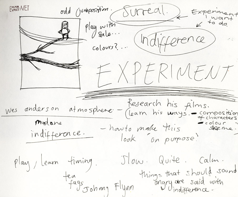
A running joke in our house that we all speak and act with the indifference and odd (sometimes abrupt) sentences. I got really excited about applying this to comics. I'm going to do more research into the films of director Wes Anderson to gather more features to replicate. I'm also going to apply his sense of composition and colour palette which i've always loved.
I'm really excited about this and can see lots of opportunities.
I think it's quite and challenge to get across that the characters look expressionless and indifference on purpose not from lack of skill when portraying emotion.


JUST THIS

New experiment. Also a story that i wrote after one evening in my student house. I thought it would make a good basic starting point for experiments in form and style. Possibly structure.


I went on to start story boarding it roughly....