'It's Just this' was a good story to use because i had no preconceptions of what i wanted it to really look like, like i normally do with my comics. Meaning i had no hang ups and was free to purely take the signatures from each directors and apply it to the narrative in order to tell it.
The Wes Anderson 'It's Just This' was probably closest to my own interpretation of the story simply because of the melancholy and 'just life' nature of the narrative and my love and use of that kind of colour palette in my own work; Actually i was influenced like this because of him to begin with anyway funnily enough.
It differs from me mainly in the way that i wouldn't have done all the cells the same and i wouldn't have such samey imagery (although it works well for the story). Also, his love of symmetry has been quite interesting to work with because i have always said i dislike symmetry in images (i'm guessing due to an art school training where asymmetry was the way to a more appealing composition). I can see from this experiment just how using it however helps the 'decorative' look his films all have. Which is one of the reasons why i enjoy them so much. This along with the 'just about people and their lives' ethos, and the fact he seems to care about his characters who have so much life to them despite sometimes doing very little. (A funny opposite to the hollow shells of formula approved characters featuring in hollywood blockbusters, in which everything in the world happens all at once...)
This applies to all the other Wes Anderson inspired work i did with this experiment too ('The Cat's Dead', 'Good Morning, Lethargy').
The Kubrik version mainly focused on eyes and his famous 'long shot'. I feel it keeps the slightly un-easily and often abrupt scenes like that of a work of Kubrik.
I think my favorite of the three however is the Lynch inspired one. One reason is simply because it makes me laugh. I'd never do something like that off my own back; Not because of dis- interest but because of a lack of time to be spent on things deemed more 'bread winning'. Another is, i think it has the odd unease and the amusing yet oddly disturbing quality to it that is associated with Mr Lynch. It totally changes the way the comic is perceived and it's interesting to read it like that and have this interpretation. The pictures in the case of this one especially really do add to and effect the narrative; Rather than just playing second fiddle to it.
The experiment really works as an a test of narrative structure and form; The same story presented in different ways and thus read differently by the viewer. It also has the fun element and research behind it of the directors to give it a certain direction and another way in which the success can be evaluated if you know the work of them.
The research experiments into abstraction was on top of everything else, was in particular something i would never think to do unless i had written doing so into something like this. As it is nothing to do with my practice apart from the questioning nature of storytelling. I found it very freeing in the way i think about things when i first start projects and there were things to be learnt and applied to my authorship just from that.
It was interesting looking into colour theory and the meaning behind them more and that, of course, can be applied. Symbolism is also a slight curiosity to me.
This project has been amusing and good fun as well as getting me thinking indifferent ways, like i hoped it would. I can see really how they effected and helped my major project. Most noticeably in i think with 'Numb', a comic i did as part of my FMP. I applied a different form. Brush pen-y and a more visually and flowing page layout. Different colour colour palette. Wes.
I defiantly want to do more comics with the wes colours and even maybe try more with the decoration (i've always liked drawing rooms with wallpaper) and symmetry.
All in all, it just made me approach comics in different ways and think differently about how i would and could do them; which was the point. So i think it was a success in that way.

Monday, 7 May 2012
Sunday, 6 May 2012
Wes Anderson Just This- Abstracted and Wordless Versions...
So due to the way that the Wes Anderson version of 'It's Just This' was coloured on the computer (to get those lovely colours), i found it interested that when i took away the lines layer in photoshop it created a abstract version of the comic. In the same way that i was explaining before with creating abstract versions this way. I think in this case it is quite effective as you can gage the narrative quite well when left with the text...or at least the tone and the surroundings.
The colours are more pronounced and part of the story telling process when it's like this as well i have found.
ABSTRACTED:
I also thought this story would be a good one to experiment with form by making it wordless. I think the tone and atmosphere still come across quite well. The narrative can still be guessed more or less as nothing really is happening in the narrative anyway.
WORDLESS:

EXPERIMENT: WES ANDERSON - Just This

WALKTHROUGH:
This is the director where i think the story fits most. The indifference, not much happening, insight into people's lives synonymous with Wes Anderson films.
So beginning with the typeface used...Futura; used in most of his films for the credits, title, chapter in films text on screen. Usually i always want to hand render my type but i felt in a case where the director has a font associated with them i had to use it.
I also did the cells in the narrow shape to match the narrow with black border framing his films always have.
The first cell is a homage to the focus on a significant gesture used in his films. (The Royal Tenenbaums) and the many times he films from the above, centred items below.
Framing of characters, the symmetry! The decore, wallpaper and attention to detail to explain who the characters are. (Rushmore)
Faces at despairing moments. Framed like the third cell. (Fantastic Mr Fox)
Indifference, emotionless.
Repetition of the same place, the same shot, fits well with the point of the samey-ness of life the story is talking about.
character moving around in the same space.
Characters in the same arrangement but somewhere else, with the same expressions.
Close up when introducing/meeting and explaining new characters.
WALLPAPER.
More preoccupation with symmetry.
More focus on small gestures.
More focus on small gestures.
I also did a version with a black background for visual purposes. I think it probably looks nicer like this? More fitting with the movie feel?...

EXPERIMENT: STANLEY KUBRIK - Just This
 WALKTHROUGH:
EYES! A common use for an insight into the character and their emotions. Extreme close up of eyes.
Framed characters as introduction to them, who they are, how they are feeling.
Flashing images, sudden, often red. Abrupt. Disturbing. I thought laughing faces was appropriate for both this and the story i'm trying to tell itself.
Crazy colours. Sequences of them.
Red face.
'Social surrealism' The room, meet the characters, who they are by how they live. Kubrik often uses images like stills in his films (A Clockwork Orange). A fan of 'a painting is worth 1000 words.'
Sequences. The long shot. Often Kubrik uses, and is famous for, using really long continuos shots throughout the same space where many things can happen or be explained. So i did the same. (The Shining).
Red image.
Extreme close up of eye for new character.
Social surrealism again. You meet joe, a still explaining joe by what he is doing, what his surrounding are.
EXPERIMENT: DAVID LYNCH - Just This
First up is David Lynch...
 WALK THROUGH:
WALK THROUGH:
Lynch films often have over-worldy elements to them or just the general feel, Surreal and unexplained, unnoticed oddness. Start with going into an ear (Blue Velvet).
Often funny yet dark. That sort of not sure why you are laughing/why it's funny/is it funny or is it gross?!
Unexplained screaming (Eraserhead), strange detached expressions.
Sat at a tabe cell- Normal situations/ the mundane but odd in some uneasy way. Weird. A common device in his films.
Funny/sick?
Out of this world.
The lone figure...lynch often has shots like this. The innocent amongst a mess of bad things.
Red Curtains (mise-en-scene of Twin Peaks)
Fade to white.
The whole thing is in black and white (except the red) Because it seemed fitting with the dark tones and Lynch uses this idea too.
Macabre yet mundane.
Plans for film director experiments...
I can find the things i am experimenting in more pronounced and obvious in films and i love watching them (good ones!). So looking at directors with a recognisable 'style' is a good way of playing with narrative structure and form as i already have an understanding of codes and conventions attached to certain films and know what to look for in terms of further reasearch.
So one of my objectives and probably the one that interested me the most was trying to learn from the storytelling devices of some film directors. It's been running throughout this project as you can probably see in my sketchbook scribbles i've uploaded. I would now count this as main main experimentation really. I didn't know this when i started but it's interesting to see which planned experiment has taken off.
When i first had the idea it was mainly focusing on Wes Anderson (director of, Rushmore and The Royal Tenenbaums...) Trying out doing a comic with the tone and passing of his films (The Cat's Dead). Also a picture that had the cinematography, colours, symmetrical, placing of characters.
Now i've narrowed down to 3 directors that i'v researched the devices and signatures of...
David Lynch.
Stanley Kubrik.
Wes Anderson.
I'm going to use my 'It's Just This' script that i came up with early on in the process. I think It will be good to use because firstly and simply i want to do something with it. But more importantly for the point of this experiment i think it is a good starting point for variation.
In the picture below you can see some of the main points i've highlighted to use in this experiment for each director.

The storyboard for the David Lynch 'It's Just This'.

The storyboard for the Stanley Kubrik 'It's Just This'.

The storyboard for the Wes Anderson 'It's Just This'.

Wednesday, 2 May 2012
EXPERIMENT: Surrealism- Pip's Picnic.

A painting i did as concept art for a story my friend wrote for me with my characters. It's about a picnic and then it falls into another dimension...
I want to do something bigger with it one day but for now i though as a surreal story it was appropriate to talk about it here in turns of experimenting with the surreal.
Hemingway: An Experiment in Structure and Form.

I was reading a Will Eiser book on graphic story telling and visual narrative and i came across a bit where he talks about the structural difference between comic books and the pannel strips in newspapers. Where comic books have resolutions most of the time. Told like conventional stories or film narratives. Panels could be seen to be most representational of real life. Each strip leeds onto the one next, so there is no closure in the way that comic books do.
I've always liked the idea of doing comic books with no real resolution and just a glimpse into some characters lives. How they live, what they do on a dy to day existence. To be more like life.

Another thing i found interesting in the previously mentioned book, was about the famous Ernest Hemingway idea of the shortest possible story.
The story is:
'For Sale. Baby Shoes. Never Used.'
It's clever because this is all the information you need to let the reader do the rest. It's easier to understand the narrative that could be surrounding these words.
Eisner says 'It would not be hard to write a larger story around this core. The power of this story lies in the skill with which the selection of the "touchstone" points are made. They co-opt the reader and immerse him or her in a sea of memory and experience. Cleverly, it forces the reader to "write" the story.'
He then goes on to provide a three pannel visual to evoke a setting. This gave me an idea of trying my own version of this using the same methods.
My story is simply:
'Flat for let. Haste needed.'
I to provide some visuals...

I drew a small thumbnail of how this could work...

EXPERIMENT: COLOUR: Connotations and abstracting to the absolute further...
'In just a glance, colour defines things in a viewer's mind before they have a chance to interpret words or images. It can even change the meaning of an image or a word entirely.' (Marks, 2006: p9)
Still working with the absolute and abstraction, I've started looking into colour. From research and previous knowledge, different colours have many different meanings. Most people have similar connotations attached to certain colours.
So it's about the context a lot of the time.
Using research in the context of turning my story 'The Cats's Dead', i've used some common associations of certain colours.
Pale blue: calm, uncertain, underlining sadness
Increasing Grey: sorrow, somber
Pale yellow, nerves, anxious, slight worry
The darker blues: sad, loss
Greeny greys: calm sadness with increasing sadness
Light red: tinge of anger
Dark red: strong feeling, sudden, anger moment...more specifically in the case of this story it is the abrupt statement laced with accusation.
The shades of purple: confusion, slight questioning, worry is present.
Turning to grey: nerves turning to sorrow

COLOUR CONNOTATIONS: A Thought.
What came first our associations with the colour, take bright green, as 'go' because of it's use representing 'go' or us thinking it was 'go' before. It's a circle. What caused it...?
In some cases it's more obvious like green also being 'the environment/environmental', which makes sense as the physical thing is mostly green.
But with feelings and emotional representations it's a bit more to do with psychology. Where did those preconceptions come from...? I'm going to go completely of point if i look further into this. I just thought it was interesting.
Anyway i think abstraction has gone as far as it should for this project's timescale. When you get to the point of just drawing coloured boxes i think it may be time to move on...
Paths to the Absolute.
Famous abstract painter, Kandinsky, once asked himself 'Speaking of the hidden by means of the hidden. Is this not content?' regarding the point of symbolism. When we view his painting we are 'simultaneously looking at what it is concealing. veiling'. (Golding, 2000: p82)
Applied:
What is more prominent in the narrative in terms of emotion or subject matter.
You know it's symbolism so you are looking for meaning in what is hidden/not shown. Aware of looking for what is hidden for meaning. Strange to hide something that you then know the point will be to look for it...

For this picture i used the same codes and shapes that i had come up with for the rest of these related pictures. Red scribbly anger, the orange triangle cat, the dead triangle cat with the sign of death. The blue-ness-overwhelming sadness the comic has to it's theme. The murky confusion in the middle and the smaller orange triangles where the cat is recurrently thought about throughout the narrative. The white running through it is the distraction about the freezer defrosting...
The video to the below is anger turning to confusing. Anger is represented in this case as an imposing red square, while confusion is a swirling murky mess.
By filming this moment, the transition becomes the story. An interesting thought in the way of the form of storytelling.
EXPERIMENT: Abstraction 3...Rise of the Triangle/Narrative through Symbols

I used boxes/cells, a common structure device associated with comics to hold the picture together and control the narrative/the way the viewer reads the image and is taken through the story.
This is about assigning connotations, whether pre-existing or not, to shapes and colour to create appropriate mood and feeling that suggests what is going on in the narrative.
Like before, i recorded the process of drawing out the story as i am interested in the idea of that too conveying the narrative in a different, possibly clearer, way.
The narrative plays about before the viewer and they can follow as the story and emotions unfold.
Clearest, simplest design. Even this conveys a narrative.

Tuesday, 1 May 2012
EXPERIMENT: a small abstract test.
So i did a quick test from a thought i had regarding abstraction. That the painting can be read as telling the story or you could record the progress and tell the story that way. The painting isn't good but that wasn't the point.
The Finished painting.

EXPERIMENT: Abstraction 2...this time it's personal/colour without lines


This is a page from my final major project, 4AM. On this page especially, just having the coloured boxes to read you get more of a sense of an atmosphere and time of day from the colours and general shape of what could be (is) landscapes, trees and clouds, without the preconception of knowing the location/item pictured truly looks like.


Tuesday, 20 March 2012
EXPERIMENT: Abstraction

An experiment in abstraction using a page from my major project 4AM.
Reading the story through the lights in a night club scene. Does it still read the same story? What else does it suggest? Other meanings? Or is it simply more obscure and therefore more interesting? I think it is indeed quite interesting and it's giving me more ideas for where else this could go.
Not much is happening in the the actual comic page. I just wanted to see if you would read the same thing happening or if you understood it differently ion some way because of it.
Tuesday, 6 March 2012
The Cat's Dead.
The Times: "Wes Anderson's ... movies, such as Rushmore and The Royal Tenenbaums, tend to drive audiences into two camps: those who see them as emotionally dead baubles wrapped in self-regarding irony; and those who see them as the apotheosis of film craftsmanship. The Darjeeling Limited is hardly going to bridge that gap". The Times
^ Hutson, Graham; Siret, Mal. The Times (London).http://entertainment.timesonline.co.uk/tol/arts_and_entertainment/film/film_reviews/article2915999.ece.

I did a proper comic drawn out from a script i wrote and with my own characters. Using the slow pacing, long pauses, emotionless expressions and sentences that go nowhere of Wes Anderson. Towards the end it's meant to turn into more Stanley Kubrik in feel; With flashing images of close up faces and use of red.
Monday, 5 March 2012
GOOD MORNING, LETHARGY.

Did a more finished painting using some recurring themes from Wes Anderson iconography and my own characters.
Sunday, 12 February 2012
Reading into Mr Anderson.
 Starting a bit of proper research into Wes Anderson films with proper research theory as a backdrop rather than just my own observations.
Will be doing more and learning the ways to do some more finished and hopefully successful experiments.


The Unexplained Scene...
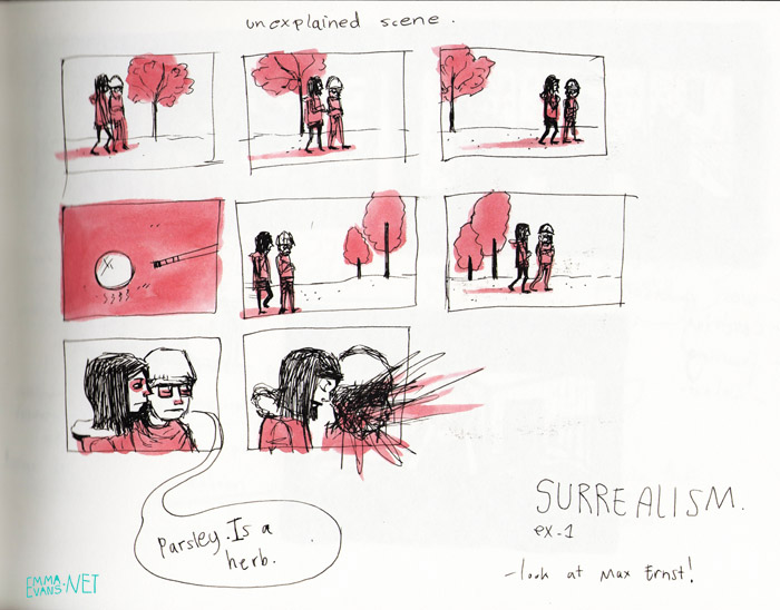
Thinking about a bit of surrealism. More in depth stuff to come.
-----Unexpected, unexplained juxtaposition-----
Monday, 23 January 2012

Monday, 16 January 2012
EXPERIMENT: Kubrik
Also gonna do this with Stanley Kubrik as well.
Lots of red and quick cuts to related scenes/objects that aren't acknowledged in the main comic cells.


strange colours and the monolift.
Lots of red and quick cuts to related scenes/objects that aren't acknowledged in the main comic cells.


strange colours and the monolift.
EXPERIMENT: Wes Anderson.
A running joke in our house that we all speak and act with the indifference and odd (sometimes abrupt) sentences. I got really excited about applying this to comics. I'm going to do more research into the films of director Wes Anderson to gather more features to replicate. I'm also going to apply his sense of composition and colour palette which i've always loved.
I'm really excited about this and can see lots of opportunities.
I think it's quite and challenge to get across that the characters look expressionless and indifference on purpose not from lack of skill when portraying emotion.
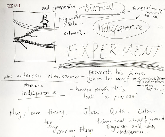


I'm really excited about this and can see lots of opportunities.
I think it's quite and challenge to get across that the characters look expressionless and indifference on purpose not from lack of skill when portraying emotion.


JUST THIS
New experiment. Also a story that i wrote after one evening in my student house. I thought it would make a good basic starting point for experiments in form and style. Possibly structure.


I went on to start story boarding it roughly....


Subscribe to:
Posts (Atom)